Drenched.

This project will capture animals who love water getting soaked and interacting with spraying water.

http://thedo.gs/2013/01/training/can-i-use-a-spray-bottle-to-make-my-dog-stop-barking-at-the-doorbell-46594/7544/

I think its important to a project that it has direction and I can see these images being used as an advertising campaign for a dog management site or as an advertisement for a dog magazine or business. I will not create these image with only these ideas in mind but giving a project some direction is important.

The Image

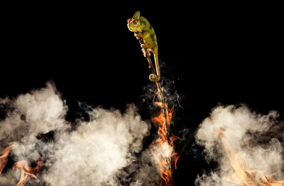
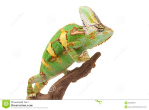
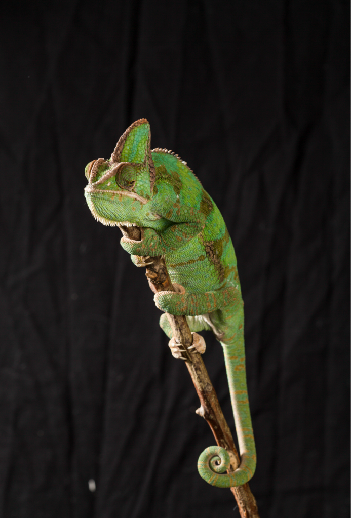
Today I shot the first part of this image on a black background using high speed flash and a macro lens. I photographed the chameleon is a series of poses but couldn’t get it to pose correctly with arms outstretched as illustrated in my original plan. I altered the idea slightly and went for the image below with the chameleon holding on to the top of the branch. I think it looks like she is worried with a slightly downward titling mouth and eyes looking down too. Chameleons have an amazing ability to move their eyes independently and still be able to focus and this dexterity really helps me to create an emotion in the subject. I persuaded her to look down by holding a mealworm just below the frame and wiggling it to catch her attention. This was one of the more challenging shoots but I am happy with the results and think this image will make a strong starting point. Screen Shot 2015-04-23 at 21.42.42

Screen Shot 2015-04-23 at 21.43.07

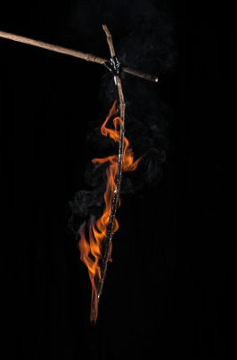
once home I was able to shoot the rest of the stick using the same camera settings and lighting. and merged the two together in photoshop.

Screen Shot 2015-04-23 at 21.44.27I then shot smoke using a mist machine I have made and overlaying these layers onto the original. I have also changed the ration of the image so it is in landscape format. My research images were a mixture of both landscape and portrait but since this image is intended for web use and most screens are landscape I decided to select this orientation. The smoke layers have also been coloured to match similar images of forrest fires smoke that I found on the internet. Shooting the original image on black allowed these layers to be quite simply merged.

Screen Shot 2015-04-23 at 22.12.32

Photographing the same stick again I doused it in lamp oil and set it on fire. That image was then added to the original. The image was shot outside and the wind was effecting the direction of the flamed to counteract this I used multiple layers of fire to give an even burn on the stick. Screen Shot 2015-04-23 at 21.46.42

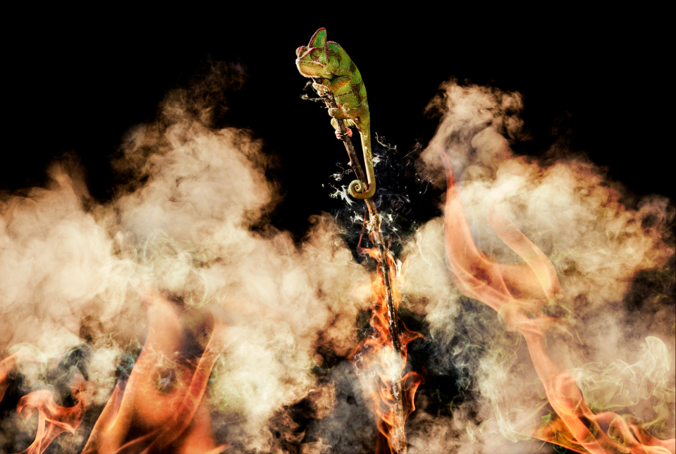
This was the image I came up with. I am pretty happy with the result using the same stick allows for more realistic editing and some other flames were added at the bottom of the image to emulate a real forrest fire. I consulted a few of my colleagues and they suggested I maker the flames even more prominent and add more smoke. I think that this will make the picture even more dramatic but looking at the other images WWF uses I don’t think this is necessarily a bad thing.

THE FINAL IMAGE

I am very pleased with the final image. Photoshop is not one of my strongest points but I have really enjoyed shooting all the plates and editing them together. I made a few final adjustments to the final image. I added more flame and smoke dodged and burned the chameleon so that it looks as if the fire is partly lighting it and gave its underside an orange glow. I also added an orange glow to the smoke edges and colour toned the whole image. I think the image fits with the other WWF campaigns that I have seen both in subject matter and presentation and I look forward to hearing the results from the competition. Screen Shot 2015-04-23 at 21.47.19

My Image

My image will consist of a single chameleon on a branch reaching out across to another branch that is obviously out of reach. I will use two lights one soft light directly on the chameleon and the other a rim light will orange gel to look like burning. one the chameleon shoot is finished I will photograph the branches again charcoal mark them and burn the ends as if they were burned apart I will use a smoke machine to create a smoky mist for hang over the image and will blend this into my final image. Shooting these images separately will give me more creative power over which area are to be affected and will mean the chameleon can be photographed in a completely safe environment.

I have made a very crude mock up of the final photograph  using stock images. I find this useful to see how I would start to build an image as my sketching skills are pretty poor. I will photograph the chameleon first as it will be the hardest and most unpredictable parts of the image to capture and I can build the rest of the set to fit around it.

Screen Shot 2015-04-21 at 01.15.48

The Statistics.

http://rainforests.mongabay.com/20madagascar.htm

Reading about the conservation efforts for Madagascar and they all seem to revolve around the deforestation on the island. there are only 20% of the original forests left and its not so much the destruction of these forrest as there are still many miles of untouched land. but its the isolation of these sections that’s having a very serous effect on the wildlife. living in small isolated areas is effecting the breeding of so many different species and the ecosystem relies on these species. most of the land is burnt for agricultural land and I want to produce an image that shows this clearly but also very visually. The subjects that I have chosen (chameleons) cant get away from these fires and they are being pushed into smaller and smaller areas. I plan to use fire, and burning branches in this project to show the deforestation up close.

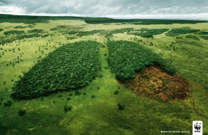
original_fu_545e4faeb858e WWFLUNGS

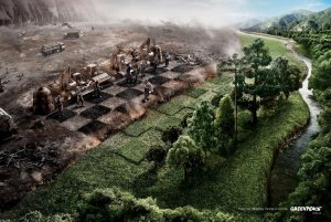
Images that show this deforestation almost violently seem to be quite popular with wildlife conservation organisations. an immediate danger to the subject is a good way of catching the eye and forcing a reaction with your viewer.

Chameleons

I have decided to photograph Chameleons for this project I think they are a good representation of a species that is under threat but is not a well publicised this project will hopefully bring more attention to these wonderful animals and the struggles they are facing in the wild. I think there bright colours and prehistoric appearance will make them an eye-catching subject and will help them to stand out. I have sourced a number of them in Glasgow and plan to photograph them at there owners home unsung a portable studio. Unfortunately there are very few rare species of chameleon in captivity so the ones I will be working with are Yemen or Veiled  Chameleons.?????????????????????????????????????????????????????????????????

They are not the most unusual chameleons but can have some beautiful patterns and are one of the more sturdy species making them ideal pets.

Photographing chameleons is a tricky business they can be very temperamental and don’t like change. Even sudden movements can spook them and a byproduct of this is becoming very dark and dull coloured. I plan to use the colour of the chameleon to illustrate my point using its skin as a canvas for my message and I need the chameleon light coloured to make this process as simple as possible. The animal will be placed on a bench that it is used to and photographed with low power flash. I plan to keep the shoot as short as possible as stress for these guys can be fatal. I plan to create a pattern of the chameleons body to represent a statistic about habitat destruction or dwindling numbers. using colour tools I hope to show clearly the statistic in a visually and easy to digest fashion as I believe this is one of the most powerful ways to convey your concept.

WWF Adverts

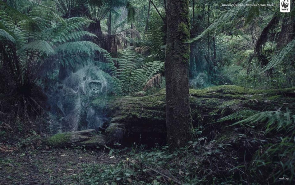
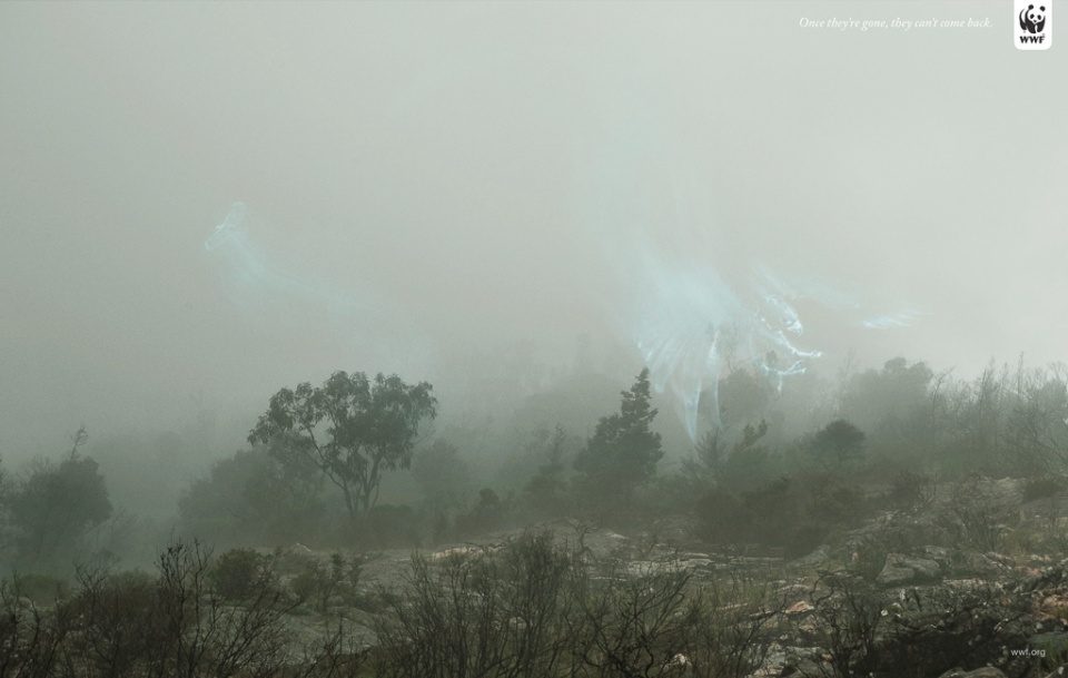
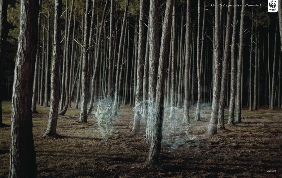
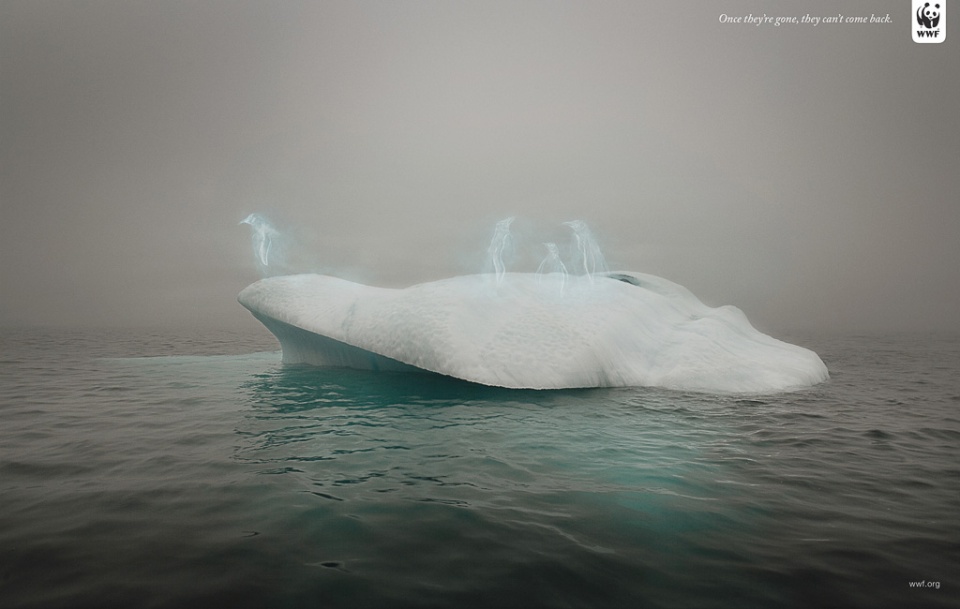
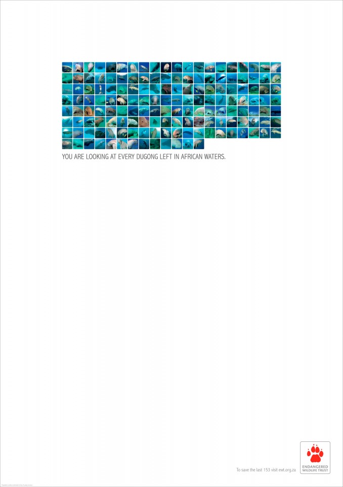
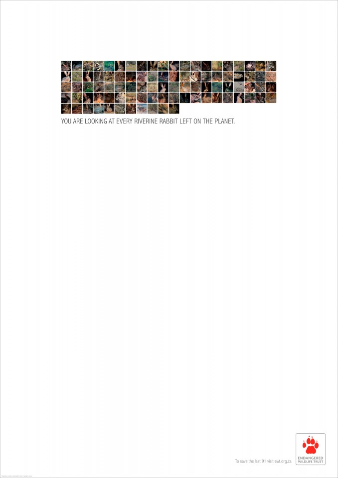
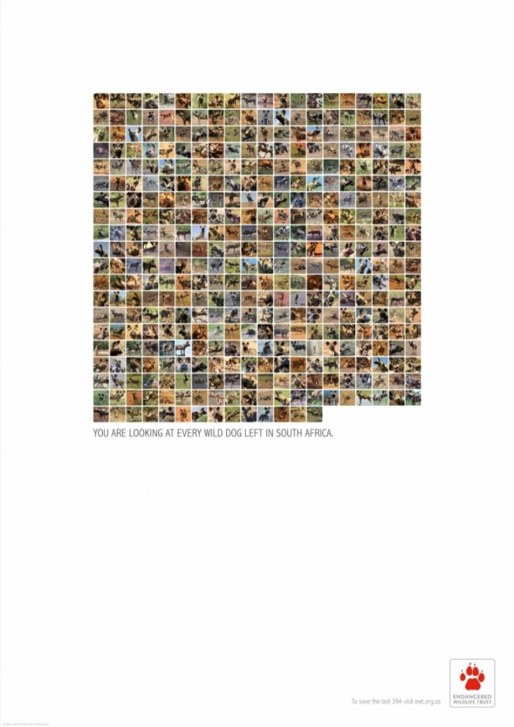
WWF Have a large collection of adverts and have commissioned many photographers to shoot for them. The create visually and conceptually strong images for their campaigns. These images are by photographer Simon Harsent and depicts a selection of endangered animals as ghostly figures in natural landscapes. This project won at the D&AD advertising award in 2013 and is a wonderful example of conceptual conservation advertising. Although these images are wonderfully executed and have won awards I don’t think they fit into a social media brief. I Think my images will need to be brighter more colourful and obvious.  1Scsf1kg22maDHFpnthw9hqfRKTLQyx7QMyYyZ3t3y7R5FOx8WSGZ1Q5D3mEy638n AryNZ5bfX9qTwh1DkwrC7fOyett6EPD2TswP2ELS7Sb1gxj8amKOcO7d4WY1rSzSO mnfGMExTkF76SgES76mZm3nh9H9n6Xp71PK1r2sfeaFXM4eTWXYxf5afm4EdysAK6 XZRkpfT7R7P4j4rbWnBM5Ls7aXCnADZhNTX8QOrWe7NGmpaRe7RD5sYQKmSxPLYXCI found these advertisements for Endangered Wildlife Trust. They are by a collection of wildlife photographers and have (for me) one of the most powerful conservation messages because of the simplicity of the images but also because they show the whole story and give you the facts and figures in a very simple but visually powerful image. I think showing the facts in such an easily digestible way is perfect for this brief. The only problem I have with this project is the size of the images and the text. Its crucial to the concept that the images only take up a small part of the campaign but this was a print based advertising campaign and I don’t think negative space works as effectively on web and social media. I plan to take the positives from both these projects the stunning nature of Harsent’s work and the simplicity and statical nature of the EWT adverts. 201107182301151177 201107182301276676 wildlife_protection_wild_dog

And My Subject Matter is…

I have decided to create an image for WWF.

Focusing specifically on Madagascar as a region and the chameleon populations on the island.

This is the page on the WWF website for Madagascar.

https://www.worldwildlife.org/places/madagascar.

It mentions chameleons but doesn’t go into much detail about their status. Madagascar is home to nearly half the worlds chameleons and although only a few of these species are classed as critically endangered the rate of deforestation in Madagascar will cause many more of these wonderful species to become endangered. I found an article about the chameleons of Madagascar and its stresses the importance of saving these species before its too late.

http://www.iucn.org/news_homepage/all_news_by_region/news_from_eastern_and_southern_africa/?18231/Madagascars-reptiles-Highly-threatened-but-not-yet-over-the-edge

My Chosen Subject Is…

I have chosen to shoot for the Tim Flach animal conservation brief. I feel this brief suits my work better and I think the judges would be less likely to select an animal image from another brief when this one is animal based.

I am looking at this brief from an adverting viewpoint and want to create an image that will grab viewers attention and also have a clear and obvious message.

I plan to work with colour. This is a campaign for social media and should be developed to fit this setting. With the attention span of online viewers estimated to be less than 8 seconds getting your message across quickly is more important than ever. I plan to create an image that not only captures the venires attention but gives its message fast and bluntly this should maximise the success of the campaign.

What to choose?

There are Four Briefs for the AOP Awards this year.

– Social Media – Animal Conservation

– Product Shots : Sense

– Brand Image : Charity

– Sunday Supplement Cover

There are two of these that stand out to me the first is

Social Media – Animal Conservation

Tim Flach

The purpose of the image:

Create a cover photo/background image for the social media platform of an organisation involved in animal conservation or rescue. The image should be of an animal, it can be wild or domestic, but must be something that expresses the mission statement of the organisation.

Subject matter: Animals

The destination: Website/online use only

Colour: The image can be colour or black and white.

Budget restriction: None!

This seems the obvious choice considering my chosen subject. Animal conservation is a subject I feel very strongly about and want to pursue in future work. The other project that I am interested in pursuing is the Charity brief.

Brand Image : Charity

George Logan

The task: Create a single image to highlight and promote a cause or charity that is important to you.

The cause can be anything you like, from homelessness to animal cruelty to cancer charities to fighting knife crime to environmental issues.

Ideally it should be something you are passionate about and I’d like to see that come through strongly in the image.

Image requirements: The image would theoretically be used for press, poster and online.

Format: Can be landscape or portrait.

Colour: The image can be colour or black & white.

Copy: You may accompany your image with a copyline if you feel it helps.

Tips: People are bombarded with charity advertising, so the task of creating stand out imagery is more difficult than ever. Your image needs to be powerful, heartfelt and thought-provoking. It can be literal or conceptual. You can also use visual metaphors to illustrate your idea.

As a Photographer, this is arguably the best and most inspiring type of brief I receive. I generally get involved at the concept stage, which allows me to explore my imagination. It’s also one of the most challenging as you are attempting to drive behavioural change.
BIPP Student Awards

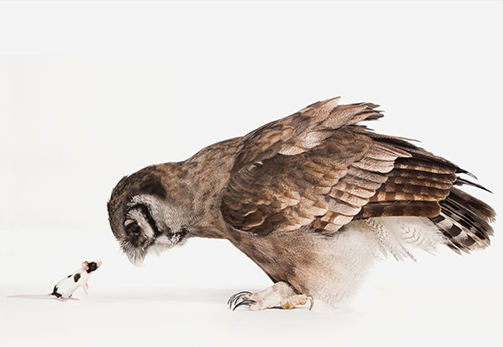
Douglas McCaffrey Catalog Image.1The image above is my final selection for entry into the Scottish BIPP Student Awards. I will be  entering this image in to the Fashion/Advertising category. This image I think best falls into the advertising category because of its comical and conceptual look. I aim to work in the advertising industry and I feel this image strongly represents my intended style and subject. The image I submit will be seen as a representation of all my work and I think that this image encapsulates all the aspects of my work that I thinks important. It’s humorous, conceptual, shows a narrative and a story and is in keeping with my particular style and subject.

The image has a strong concept and the interaction between the two subjects is key to this images success. The interaction between the two subjects adds an element of humour to this photo that doesn’t feature in many of my other images especially those with just a single subject and this is the reason I selected this image to submit I think as an advertising image there should be a strong and obvious concept and I believe this image is one of the best examples of this in my current portfolio.

The image is a composite as photographing the animals together would have been impossible as they would never interact in such a way this interaction makes it obvious that it is a comp but the white background and minimalist approach keeps the realism that I aim for in all my images. The image shows character and emotion in both subjects and having these characteristics in the image helps to separate it from a portrait to a character creation aimed at an advertising market. I feel that this is my strongest image I have shot this year and hope the judges feel the same way.

Other images.

These images came close but I don’t feel they portray my ideas and concepts as clearly as the final image.

Douglas McCaffrey BIPP AWARDS .2015.07.1

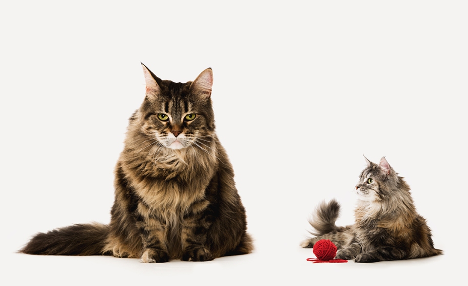
This first image also has a edge of humour and it was in the final two. I just felt that the interaction between these two subjects wasn’t as strong or as obviously funny as the other image. This image was also a composite but I think the composition of this image is weaker and the cats don’t seem to portray emotion as well as the other image. I have made alterations the the larger cats facial features and given it a scowl which I think works perfectly for an advertising brief. The final difference was in the actual subject matter cats are much more common and I thought that including an owl would help the image to stand out against any competition.

Douglas McCaffrey BIPP AWARDS .2015.03 This image has been the one that most people comment on. It has had no post process manipulation apart from some dodging and burning I think this purity makes me feel about it differently about it and I have grown quite attached to it. This however is not important in the competition because the judges have none of this information in front of them and are just judging the images. I think that this attachment to certain images can make photographers bad editors of their own work. Discussing these images with my peers and lecturers helps to put a impartial perspective on things and to critically evaluate each image on its merits and weaknesses.

_Q3J7734Ver 3

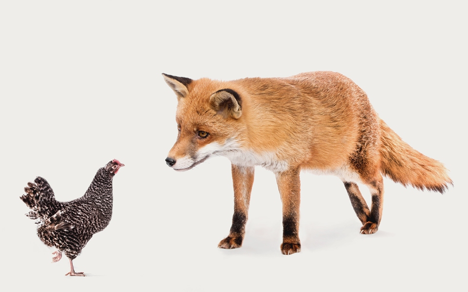
This image is from the same series as my final image and has many of the same attributes as the other. The expressions on these animals faces I think are even better and the eye lines line up perfectly. There is just a few technical issues when shooting the fox I was at a slightly different angle and the feet don’t line up the same making this image slightly jarring on the eyes. The shadows also don’t quite match up the same as the did in the owl pictures as the fox was much higher off the ground and the light wasn’t harsh enough to cast a shadow. The last fault with this image was not a technical one it was simply the size difference between the animals isn’t anywhere near the owl and mouse and I think this small part makes all the difference.